

The Art Principle of Proportion: Examining the Relationship of Sizes Between Different Parts of an Artwork and Their Impact on Visual Harmony
(Welcome, aspiring Da Vincis! 🎨)
Good morning, afternoon, or evening, depending on when you’ve stumbled upon this digital lecture hall. Welcome, one and all, to a deep dive into one of the fundamental pillars of art: Proportion!
Think of proportion as the architectural blueprint of your masterpiece. It’s not just about making things "look right," it’s about crafting visual relationships that resonate with the viewer, eliciting feelings of harmony, balance, or – if you’re feeling particularly mischievous – delightful unease.
(Why Should You Care? 🤔)
"But Professor!" you might cry, "Why bother with proportion? Can’t I just throw some paint at a canvas and call it ‘Abstract Expressionism’?"
Well, yes, you can. And many have. But even Abstract Expressionism often dances with proportion, albeit in a less obvious way. Understanding proportion allows you to make conscious choices. It empowers you to manipulate perception, to guide the viewer’s eye, and to communicate your artistic intent with precision and panache.
Imagine building a house where the door is twice the size of the roof, or the windows are narrower than your pinky finger. Disaster, right? The same principle applies to art. Bad proportion can make your artwork look… well, wrong. It can disrupt the flow, distract the viewer, and generally scream, "I have no idea what I’m doing!"
(So, what exactly is Proportion? 🧐)
Let’s define it: Proportion refers to the relationship in size between different parts of a whole, or between one object and another. It’s about how elements within a composition relate to each other in terms of scale and dimension.
Think of it as a visual conversation. Are the elements talking nicely? Are they shouting over each other? Are they ignoring each other completely? Proportion dictates the tone of that conversation.
(Types of Proportion: A Romp Through the Ratio Zoo 🦁)
Now, let’s explore some common types of proportion. Don’t worry, we’ll keep it light. No complex mathematical formulas here (mostly!).
-
Hierarchical Scale: This is where size indicates importance. The bigger something is, the more important it is perceived to be. Think Egyptian art, where pharaohs are depicted as colossal figures towering over their subjects. It’s a visual declaration of power! 👑
Feature Description Example Definition Using size to denote the relative importance of figures or objects in an artwork. Ancient Egyptian art, where pharaohs are depicted much larger than their subjects. Visual Impact Creates a clear visual hierarchy, guiding the viewer’s eye to the most significant element. Emphasizes power, authority, or spiritual significance. Application Used to emphasize the status of a character, a deity, or an important object in the narrative. Useful in storytelling and conveying cultural or religious beliefs. Example Image 
Narmer Palette – Pharaoh Narmer is depicted as larger than his enemies, signifying his power and dominance.* -
Golden Ratio (aka Divine Proportion): This is the rock star of proportion! It’s a mathematical ratio approximately equal to 1.618. It appears in nature, architecture, and of course, art! Many believe it creates a sense of harmony and beauty. Think the Parthenon, the Mona Lisa, and even sunflowers. It’s everywhere! 🌻
- The Fibonacci Sequence (0, 1, 1, 2, 3, 5, 8, 13, 21…) is closely related. Each number is the sum of the two preceding ones. When you create squares with sides that correspond to these numbers and arrange them in a spiral, you get the Golden Spiral.
Feature Description Example Definition A mathematical ratio approximately equal to 1.618, found throughout nature and art, believed to create visually pleasing compositions. The Parthenon, the Mona Lisa, sunflowers, seashells. Visual Impact Creates a sense of balance, harmony, and aesthetic appeal. Often perceived as naturally pleasing to the eye. Promotes a sense of order and beauty. Application Used in composition, layout, and design to achieve a sense of visual harmony. Commonly applied in architecture, painting, and graphic design. Example Image 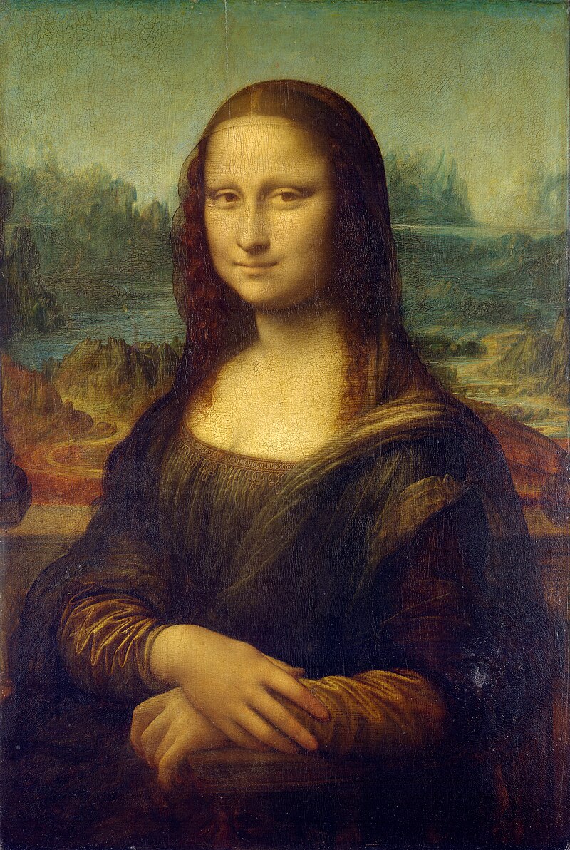
Mona Lisa – The placement of her features and the overall composition are said to align with the Golden Ratio, contributing to its timeless appeal.* -
Human Proportion: This deals specifically with the proportions of the human body. Throughout history, artists have obsessed over this, striving to achieve the “ideal” human form. Ancient Greeks believed in specific ratios, and Renaissance artists, like Leonardo da Vinci, studied anatomy meticulously to capture accurate and aesthetically pleasing proportions. Remember Da Vinci’s Vitruvian Man? That’s pure proportion perfection! 💪
Feature Description Example Definition The comparative relationship between different parts of the human body, aimed at creating a harmonious and realistic depiction of the human form. Leonardo da Vinci’s Vitruvian Man, classical Greek sculptures. Visual Impact Creates a sense of realism, balance, and beauty in the depiction of human figures. Contributes to the believability and aesthetic appeal of figurative art. Application Used in drawing, painting, and sculpture to accurately represent the human form, adhering to anatomical knowledge and aesthetic principles. Also used to convey emotional or psychological states through body language and posture. Example Image 
Vitruvian Man – Da Vinci’s drawing illustrates the ideal proportions of the human body as described by the ancient Roman architect Vitruvius, emphasizing the relationship between the body and geometric forms.* -
Scale: Scale is often used interchangeably with proportion, but there’s a subtle difference. While proportion focuses on the relationship within an object or composition, scale often refers to the size of an object in relation to something external, like the viewer or the environment. Think of a giant sculpture in a public park – its scale is determined by how it relates to the surrounding buildings and the people interacting with it. 🌍
Feature Description Example Definition The size of an object in relation to its surroundings or to other objects within a composition. A miniature sculpture compared to a life-size one, a building compared to the size of humans. Visual Impact Alters perception, creating a sense of grandeur, intimacy, or distortion. Evokes different emotions and experiences, such as awe, curiosity, or unease. Application Used to manipulate the viewer’s perspective, emphasize certain elements, or create specific emotional responses. Common in sculpture, architecture, and installation art. Example Image 
Cloud Gate (The Bean) – Its large scale compared to human size creates a sense of wonder and interactivity, drawing visitors to engage with the artwork.* -
Exaggeration (aka Distortion): Now, let’s get a little rebellious! Exaggeration intentionally distorts proportions for expressive effect. Think caricatures, where features are exaggerated for comedic or satirical purposes. Or think of the elongated figures in El Greco’s paintings, creating a sense of spirituality and otherworldliness. 🤪
Feature Description Example Definition Intentionally distorting the size or proportion of elements within an artwork for expressive or artistic effect. Caricatures, where facial features are exaggerated for comedic effect; El Greco’s elongated figures. Visual Impact Creates emphasis, drama, humor, or emotional intensity. Evokes strong reactions and adds unique character to the artwork. Application Used to convey emotions, highlight specific features, or create symbolic representations. Common in cartoons, portraits, and surrealist art. Example Image 
Caricature – Exaggerated features, such as the nose or chin, are emphasized to create a humorous or satirical representation of a person.*
(Practical Applications: Proportion in Action! 🎬)
Okay, enough theory! Let’s see how proportion works in different art forms.
-
Painting: Proportion is crucial for creating realistic (or intentionally unrealistic) depictions of subjects. Think about portraiture. Accurate proportions are essential for capturing a likeness. However, artists can also manipulate proportion to express emotions or create symbolic meanings.
- Example: Consider Modigliani’s portraits with their elongated necks. This exaggeration creates a sense of elegance and sophistication, even though it departs from realistic human proportions.
-
Sculpture: In sculpture, proportion is both a structural and aesthetic concern. The proportions of a sculpture affect its balance, stability, and overall visual impact.
- Example: Michelangelo’s David is a masterpiece of human proportion. The figure is perfectly balanced and proportioned, conveying a sense of strength and idealism.
-
Architecture: Proportion is fundamental to architectural design. It influences the visual harmony, functionality, and structural integrity of a building.
- Example: The Parthenon, with its use of the Golden Ratio, is considered a prime example of harmonious proportions in architecture.
-
Graphic Design: Proportion plays a crucial role in creating visually appealing and effective layouts. The size and placement of elements like text, images, and logos impact the overall balance and readability of a design.
- Example: A well-designed website uses proportion to guide the user’s eye, highlighting key information and creating a clear visual hierarchy.
(Common Mistakes and How to Avoid Them! 🚧)
Let’s face it, everyone makes mistakes. But knowing the common pitfalls can help you steer clear of proportional peril!
- Ignoring the Overall Composition: Don’t focus solely on individual elements. Consider how they relate to the whole.
- Relying Too Heavily on Formulas: While the Golden Ratio is a useful tool, don’t become a slave to it. Let your eye be your guide.
- Failing to Consider the Viewer’s Perspective: How will your artwork be viewed? From what distance? Consider the viewer’s perspective when determining proportions.
- Not Practicing: Practice makes perfect! Sketch frequently, study the masters, and experiment with different proportions.
(Tips and Tricks for Mastering Proportion! 💡)
Ready to level up your proportion game? Here are some tips and tricks to help you on your way:
- Use Reference Images: When working from life or photos, use reference images to guide your proportions.
- Sketch Lightly: Start with a light sketch to establish the basic proportions before adding details.
- Use a Grid: Grids can be helpful for maintaining accurate proportions, especially when working on complex compositions.
- Measure with Your Pencil: Hold your pencil at arm’s length and use it to measure the relative sizes of objects.
- Step Back and Evaluate: Periodically step back from your work to assess the overall proportions.
- Get Feedback: Ask for feedback from other artists or instructors. A fresh pair of eyes can often spot proportional issues that you’ve missed.
- Study Masterworks: Analyze the proportions in masterworks of art and architecture.
- Experiment! Don’t be afraid to break the rules and experiment with different proportions.
(Proportion and Emotion: The Unsung Connection 💔)
Proportion isn’t just about accuracy; it’s about emotion. By manipulating proportions, you can evoke a range of feelings in the viewer.
- Harmony and Balance: Balanced proportions create a sense of calm and stability.
- Unease and Discomfort: Distorted proportions can create a sense of unease or discomfort.
- Power and Authority: Hierarchical scale can convey power and authority.
- Humor and Playfulness: Exaggeration can be used to create humor and playfulness.
(Beyond the Basics: Advanced Proportion Techniques! 🚀)
Once you’ve mastered the basics of proportion, you can start exploring more advanced techniques:
- Forced Perspective: This technique uses proportion to create the illusion of depth or scale.
- Anamorphosis: This technique distorts an image so that it appears correctly only when viewed from a specific angle.
- Optical Illusions: Manipulating proportion can create optical illusions that trick the eye.
(Conclusion: Embrace the Power of Proportion! 🎉)
Proportion is a powerful tool that can transform your artwork from amateurish to awe-inspiring. By understanding the principles of proportion and practicing regularly, you can create compositions that are visually harmonious, emotionally resonant, and undeniably captivating.
So, go forth, my aspiring artists! Embrace the power of proportion, and create art that will move, inspire, and maybe even change the world!
(Thank you for attending! Now go make some art! 🧑🎨)
(Disclaimer: No actual Da Vincis were harmed in the making of this lecture.)